Issuer Admin Guide
Company Introduction Page
These pages contain the contents, instructions and functionality for companies wishing to prepare for an offer via the Billfolda platform. You will find the draft page inside your user profile in the dashboard under the offers tab.
This guide is broken into sections that are reflected in what you publish. They include;
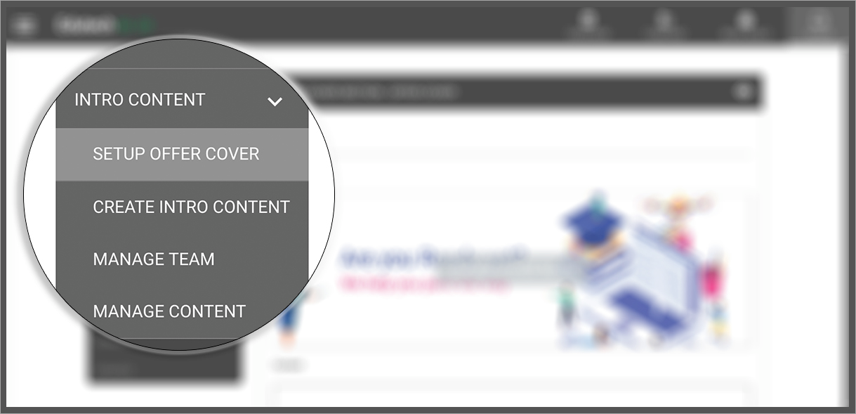
Setup Offer Cover
This section lets you set up the cover for your offer.
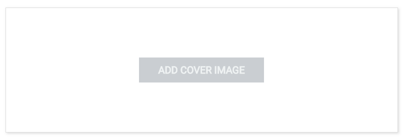
To set an image as the offer cover, upload an image with dimensions 1920w x 1080h using the Add Cover Image area.
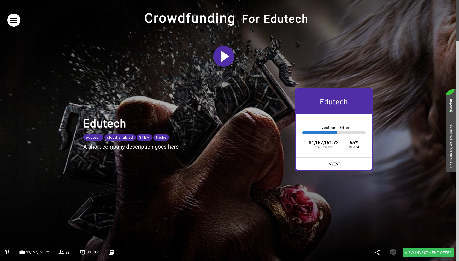
This is where you add the name of the company, which will then be displayed on your unique landing page, the same will be displayed below title and tags. See example image below:
Animations can be added or removed from this section, depending on your preference or the feedback we get from analytics.
Note :
- The title field can be anything as it is not displayed on the landing page, it's just for you and Billfolda to confirm in the Manage Content and Offer Scheduler controls.
- Image Dimensions must be less than equal to 1920px by 1080px.
- We recommended Issuer Admin to use dark background image instead of white background image.
- Image upload size of offer cover image must be less than 2 Megabytes (MB).
- Offer Cover Content word size must be less than 250 characters.
Manage Team
The Team section is where you add the company directors and senior team. The layout is flexible, so you can add multiple directors and team members, including their name, photo, position/role, description and LinkedIn URL if any.
Once added, the team section is automatically included the Content list.

Manage Content
This section is where you can manage the content that you’ve added to your company page, reordering sections, removing, and edit your work.
Once an offer has been published, the contents will be locked, unless you need to suspend and republish the offer (hopefully with some good news for investors).
An example with multiple sections of content is given below
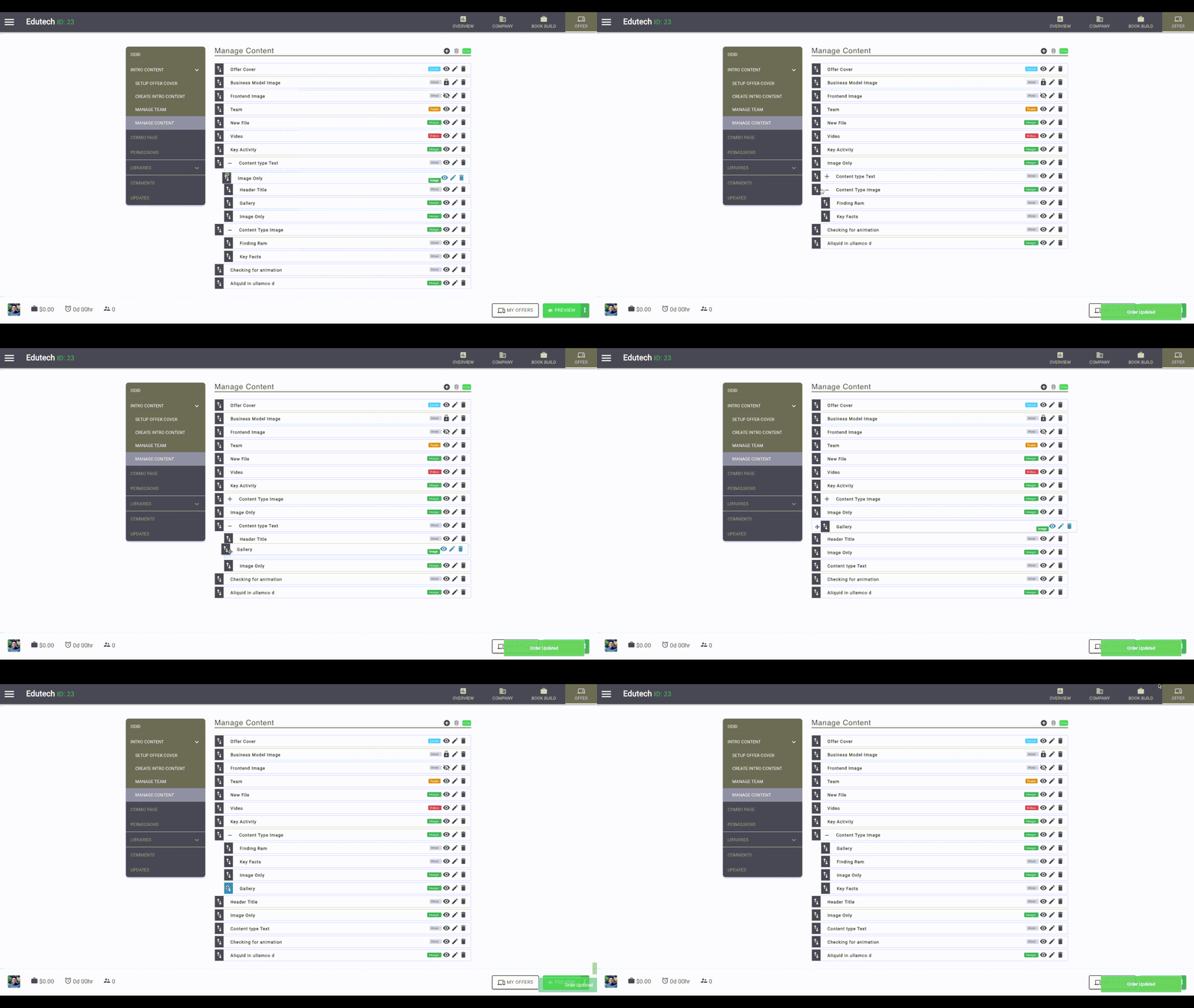
The following table lists function the actions for each icon/label in this section.
Create Intro Content
Billfolda offers substantial customization and optionality for companies we list. To get started, simply add + a new section to the page highlighting what’s great about the business.
The most important thing to consider, is the content type… what is this part of the page going to say about the company, and how can you best describe it? Video, Image or Text?
Do not stress, you can always edit and preview your draft.
So here is a quick list of the tools so you can familiarise yourself.
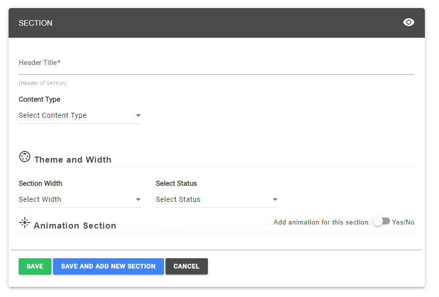
Header Title :
This field is where you can add the title of the section and which is published on the landing page as well.
Content Type :
You can add 3 different types of content as Text/HTML, Video and Image. The Content Type drop down lets you select from these 3 options, as depicted in the image below.

-
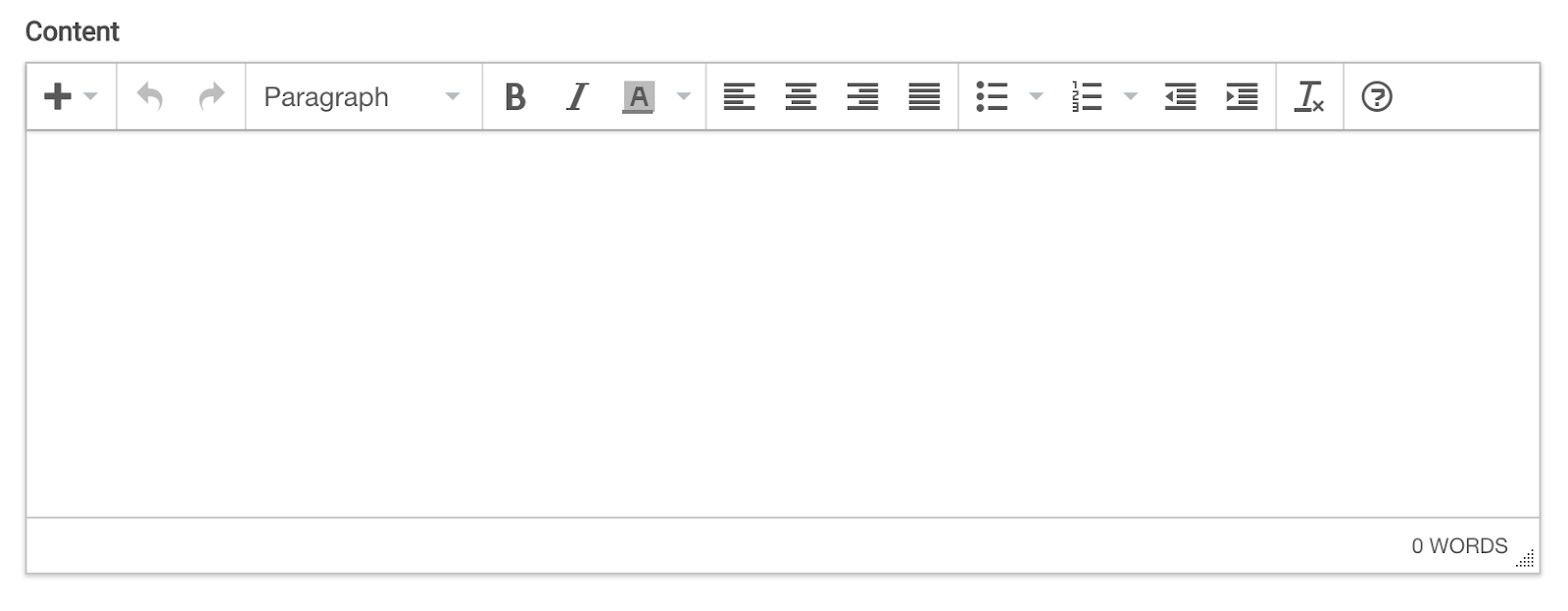
Text/HTML
The text editor allows direct input, publishing content in the same way as its input. What you see is what you get. You can format the content here, and it reflects directly in the published version. Please note that some sections have maximum character input, so choose your words wisely.
To help Google rank the content correctly, we suggest to add header tag for header and add other tag like h4, h5 or p for normal text.
-
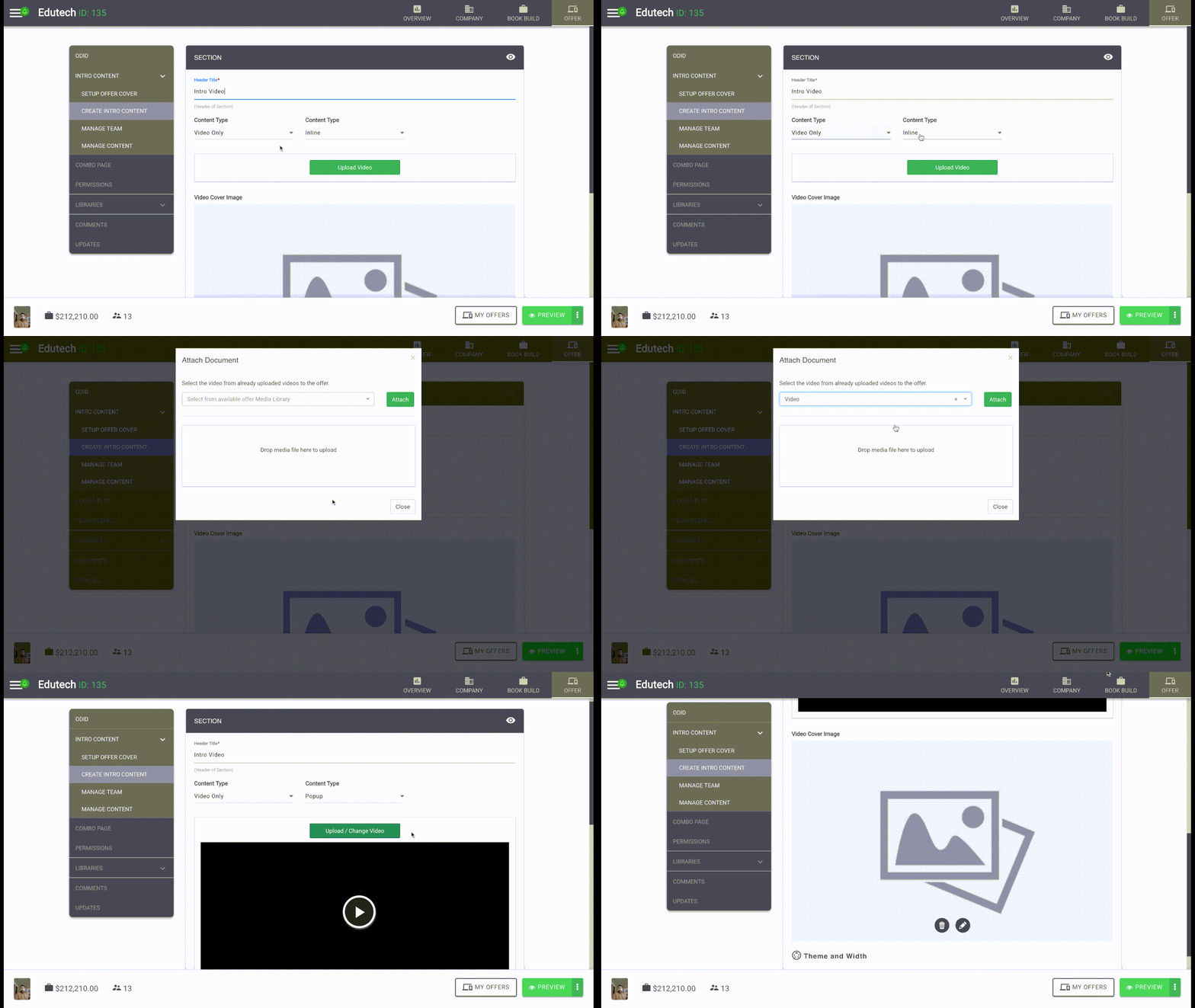
Video Only
The Video only content type is where you want to add an intro video, rather than text, image or combo sections. When selected, it enables another option whether you want the video to be placed inline or want to display it in a popup window, our preference is inline, however you can try either and we will agree before publication. We host the video and a video image which is displayed as the video thumbnail in the section.
Note :
- Video size must be less than 50MB.
- Currently, it only supports HD ( 720p) and below HD video.
-
Image Only
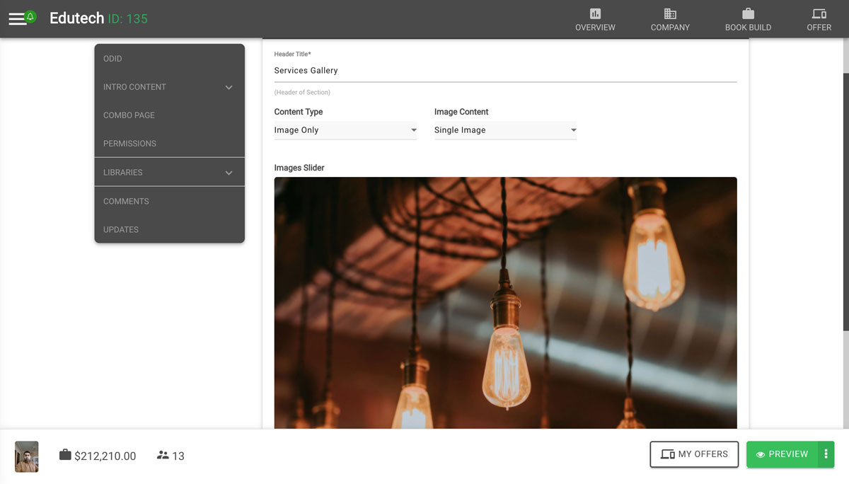
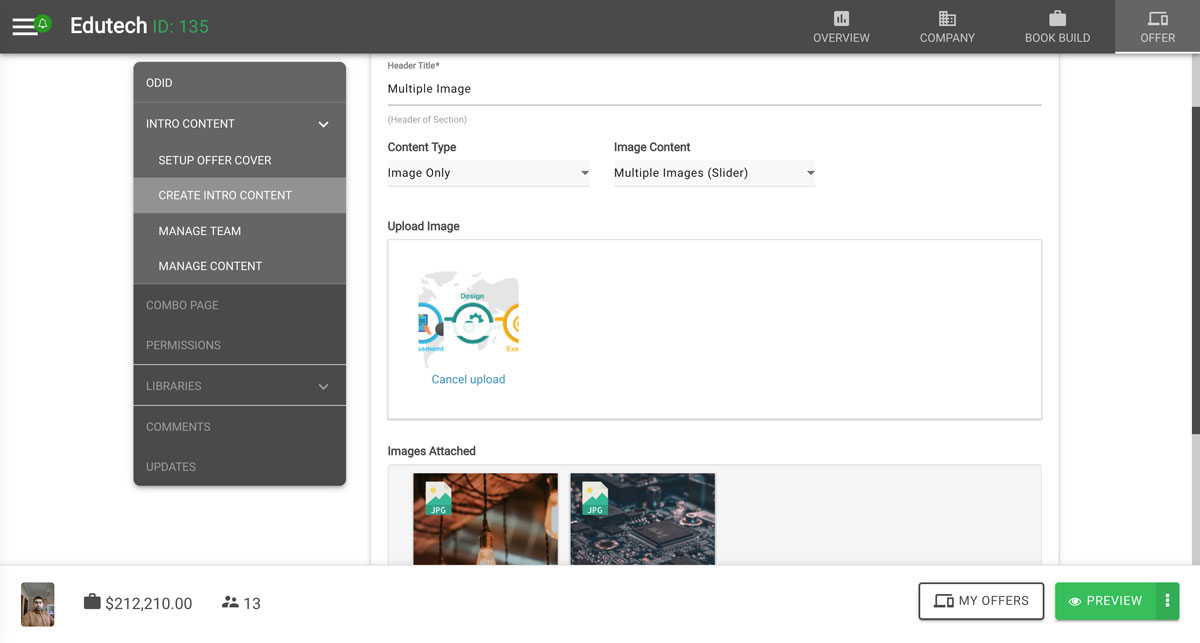
On clicking on image only, we have two options Single Image and Multiple Image (Slider).
Single Image : User can add single image without any caption.
Note :
- Size of image must be less than 5 MB.
- For full container image, width of image should be upto 1920px and height should be less than 600px.
- For half container image, we recommend to use image with equal ratio.
-
Multiple Image (Slider) :
User can add multiple image with caption.
Note :
- Size of image must be less than 5 MB.
- For full container image, width of image should be upto 1920px and height should be less than 600px.
- For half container image, we recommend to use image with equal ratio.
- For uniform look of slider, we recommend to use all images with equal height and width.
Theme and Color
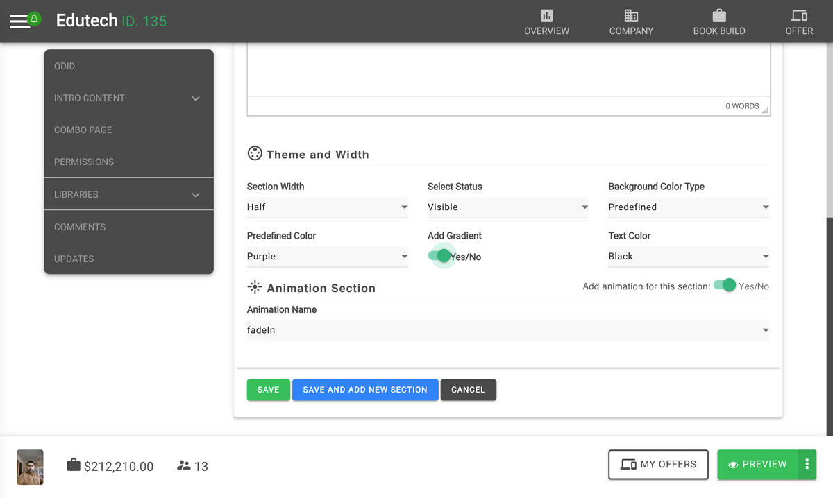
Section Width :The width of particular section can be full width of display or half width of display. In small device, both half and full width section will automatically change to full width of display. We recommended you use image and text with full width and video in half width. If image is half width, add an image with an equal ratio. Full width image should be 1920px and height as 600px to 400px.
Section Status :
Status of section can be change to visible, hidden and lock. Visible status will be visible to all once published. Hidden status will not be shown in frontend and lock disables inadvertent changes.
Background Color Type :
Issuer Admin can change background color as Predefined Color or Custom Color. Background Color is currently only for Text/HTML type of content.
Predefined Color :
There are standard 21 color set of background for predefined color and predefined color can also have uniform background or gradient background. We have set some good nice gradient according to color type of predefined color.
Custom Color :
Any color can be set as background color from custom color. Issuer Admin just need to select from color set or provide hex value of color.
Text Color :Text color generally good for custom color as in predefined color we have already add set background according to color type.
Animation Name :Each section can be set with different animation. There are different animation effect among them we recommend to use fade effect and bounce effect as this animation looks better than other animation effects in section.
